Sin cuota de manejo. Sin complicaciones.
Disfruta tu tarjeta Visa UPCARD sin costos de uso ni cuotas de mantenimiento. Realiza tus pagos del día a día, acumula puntos y simplifica tus finanzas. Todo en un solo lugar.
Recibe y realiza pagos en todo el mundo, acumula puntos y controla tu dinero en tiempo real desde nuestra app. Tu tarjeta Visa, lista para acompañarte donde vayas.
Recibe tu tarjeta física o virtual al instante.
Más libertad, más recompensas, más tú.

Disfruta tu tarjeta Visa UPCARD sin costos de uso ni cuotas de mantenimiento. Realiza tus pagos del día a día, acumula puntos y simplifica tus finanzas. Todo en un solo lugar.
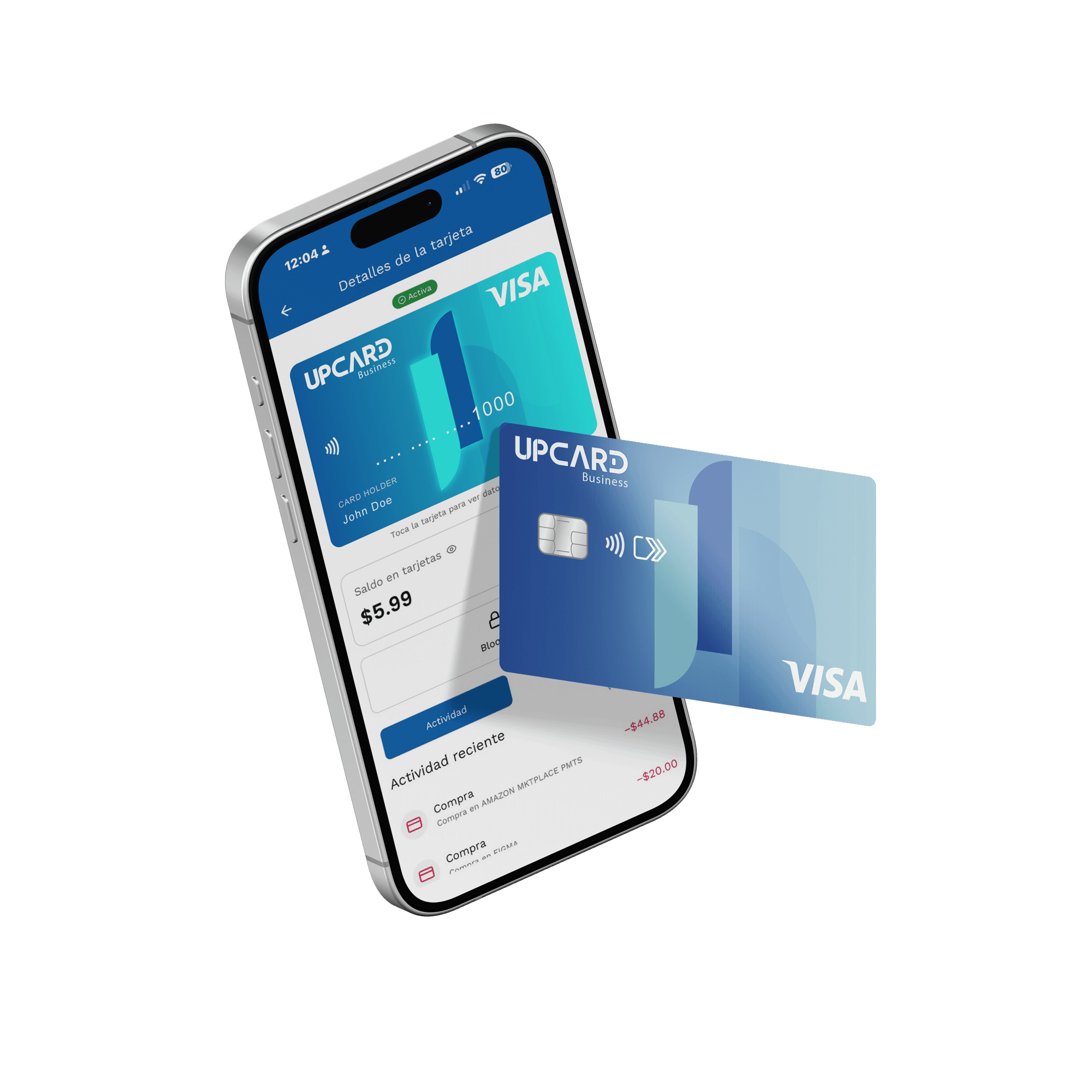
Administra tu tarjeta desde la app: revisa tus movimientos en tiempo real, bloquea o desbloquea con un solo clic, recibe notificaciones y solicita tu beneficio de nómina. El control siempre en tus manos.
Retira efectivo con tu tarjeta física en cajeros nacionales o en cualquier cajero de la red ATM alrededor del mundo.
Tu tarjeta UPCARD Visa está protegida para que compres con confianza tanto en tiendas físicas como online. Además, cuentas con nuestro equipo de soporte listo para ayudarte.
¿Ya trabajaste por tu dinero? No esperes a fin de mes. Con UPCARD accedes a beneficios de nómina diseñados para darte más control sobre tus finanzas. Rápido, seguro y transparente.
Lleva UPCARD contigo en todo momento y paga con tecnología contactless acercando tu celular al medio de pago. Accede a promociones y beneficios exclusivos en comercios aliados.
Pide tu UPCARD hoy y empieza a manejar tu dinero con total libertad.
Quiero mi UPCARDDespídete del efectivo y de insertar tu tarjeta. Con UPCARD solo acercas y pagas. Así de fácil, rápido y seguro.
Activa tu tarjeta contactless y vive una experiencia de pago sin complicaciones.
Quiero pagar sin contacto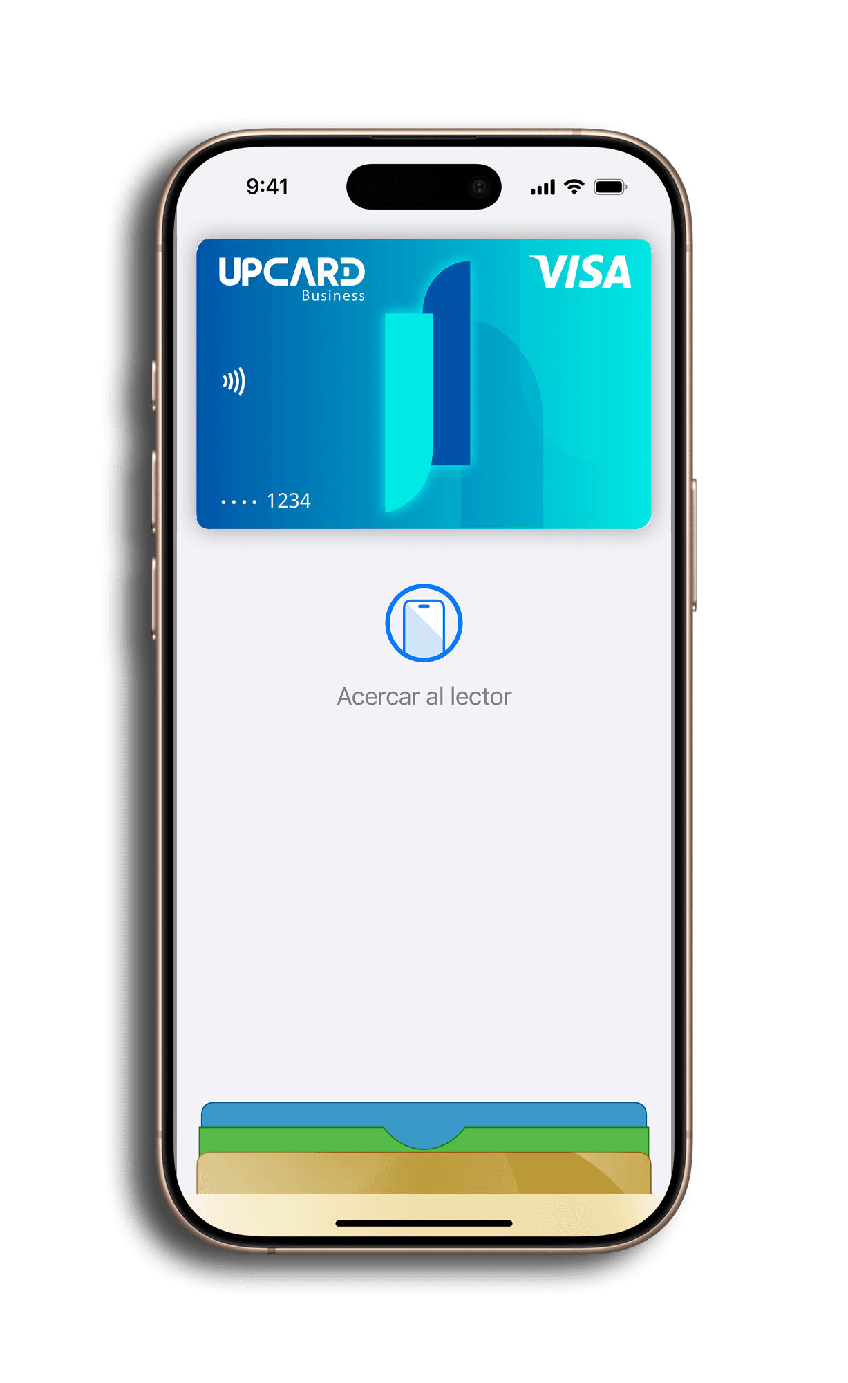
Conecta UPCARD a Google Pay o Apple Pay y olvídate de la billetera. Compra con tu celular de forma rápida y segura.
Activa UPCARD en tu billetera digital y súmate al futuro de los pagos móviles.
Simplifica la operación financiera de tu empresa desde un solo lugar: gestiona la nómina de tus empleados, dispersa pagos a proveedores, recibe pagos de clientes y genera links de cobro personalizados.
Ofrece a tus empleados beneficios de nómina exclusivos, fideliza a tus clientes y optimiza tus procesos con una plataforma diseñada para escalar con tu negocio.
Crecimiento para tu negocio. Beneficios para tu comunidad.
150+
Empresas asociadas
10K+
Tarjetas emitidas
98%
Satisfacción empresarial
L-V
Soporte dedicado

¿Ya trabajaste por tu dinero? Con UPCARD tu nómina viene con beneficios que nadie más te ofrece. Rápido, transparente y sin sorpresas.
Tu nómina, con más beneficios.
Regístrate y descubre lo que UPCARD tiene para ti.
La nueva forma de manejar tu dinero con total control y libertad.
Con UPCARD tienes acceso a tarjetas Visa nacionales e internacionales, físicas o virtuales, listas para acompañarte en lo que necesites: desde organizar tu presupuesto hasta hacer compras en el exterior con tu tarjeta en USD.
Usa tu tarjeta nacional donde Visa sea aceptada en Colombia, o activa tu tarjeta Internacional en USD para compras en el exterior. Tú eliges.
Gana puntos cada vez que usas tu tarjeta en cualquier compra.
Revisa movimientos en tiempo real, bloquea tu tarjeta si la necesitas y consulta tus puntos al instante.
Activa tu tarjeta virtual al instante.
Desde tu wallet UPCARD puedes enviar, recibir, convertir y organizar tu dinero. Tú decides cómo y cuándo.
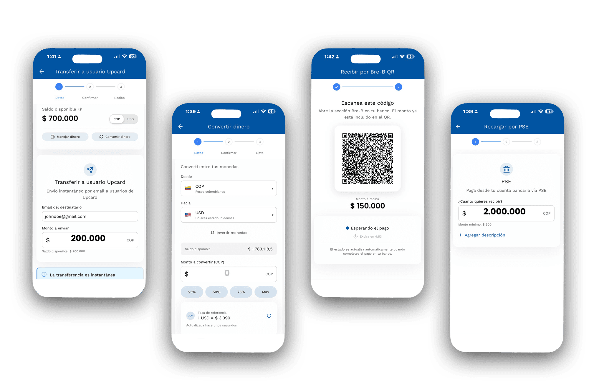
Convierte tu saldo de pesos a dólares con un solo toque y cárgalo a tu tarjeta UPCARD Internacional en USD. Ves la tasa de cambio en tiempo real, la conversión es instantánea y tu tarjeta queda lista para comprar en el exterior donde Visa sea aceptada.
Agrega fondos a tu wallet directamente desde tu banco a través de PSE. Rápido, seguro y sin salir de la app.
Recibe transferencias vía PSE, Bancolombia o Nequi directamente a tu wallet UPCARD.
Transfiere fondos al instante a cualquier otro usuario UPCARD. Sin costos adicionales, sin intermediarios, sin esperas.
Usa la red de pagos instantáneos Bre-B (ACH Colombia) para enviar y recibir dinero escaneando un código QR desde la app. (Funcionalidad exclusiva de la app móvil.)
Organiza tu dinero en tres espacios dentro de tu wallet: uno para tus pagos con tarjeta, uno para el dinero que recibes y uno para tus retiros. Mueve fondos entre ellos cuando quieras desde "Manejar mi dinero".
UPCARD para quienes quieren más libertad, más control y menos complicaciones con su dinero.
Resolvemos tus dudas sobre UPCARD
UPCARD es una plataforma de tecnología financiera que ofrece tarjetas Visa (virtuales y físicas), incluyendo tarjetas de crédito, con uso nacional e internacional. Está integrada con una app para Android e iOS que te permite gestionar tu dinero, realizar compras y transferencias, y acceder a beneficios como Puntos UPCARD y beneficios de nómina exclusivos.
Ofrecemos tres tipos de tarjetas Visa: Virtual Nacional, Virtual Internacional (se carga en USD para compras en el exterior) y Física Nacional. Todas con aceptación global y compatibles con pagos en línea y presenciales.
Tu UPCARD puede utilizarse en cualquier comercio o plataforma que acepte Visa, tanto en Colombia como en el extranjero.
No. UPCARD es una empresa de tecnología que facilita servicios de pago y gestión financiera personal a través de alianzas con entidades autorizadas. No somos una entidad financiera vigilada ni captamos dinero del público.
Nuestro equipo de soporte está listo para responder todas tus preguntas.
